Origami Rockets Wallcovering in Bohemia, WK806/08, Kirkby Design x Eley Kishimoto.
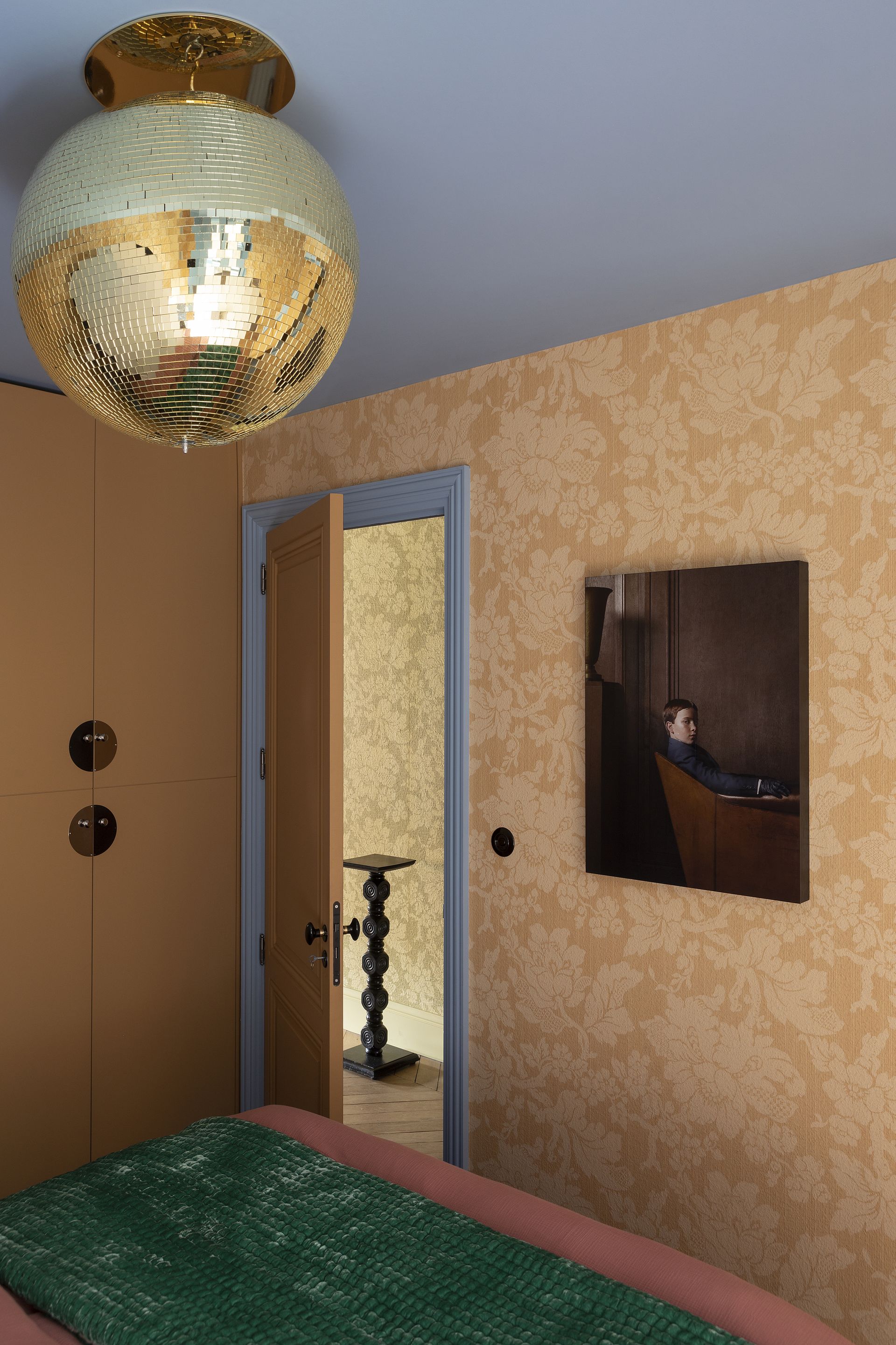
Shimmering like sunsets, this pleasantly warm and flaxen hue is elevating interiors with a touch of pure luxe. Bethan Gray has used it on furniture, Arflex has it on chairs and many designers are using it on wallpapers, tiles, and more. Plus, many colors go with gold, meaning this hue can be used for layering, to make an interior feel warm and livable.
‘We’re currently loving more nuanced versions of the gold finishes like darkened brass or light bronzes that tend to be more dynamic,’ says Candace Shure, founder of Shure Design Studio. ‘But as long as the gold or metallic tones in a home compliment the space they’re in by adding some balance and warmth, they belong and still feel timeless.’
‘We have seen a lot of brass over the past 10 years,’ says Shannon. ‘It seems that people are starting to veer more towards silver tones. Stainless and chrome are making a comeback and we’re here for it. Stainless combined with marble or travertine is a minimalistic approach that feels luxurious.’
